Absolute Batman #25 and the Manga Cover Revolution: Why Collectors Are Taking Notice
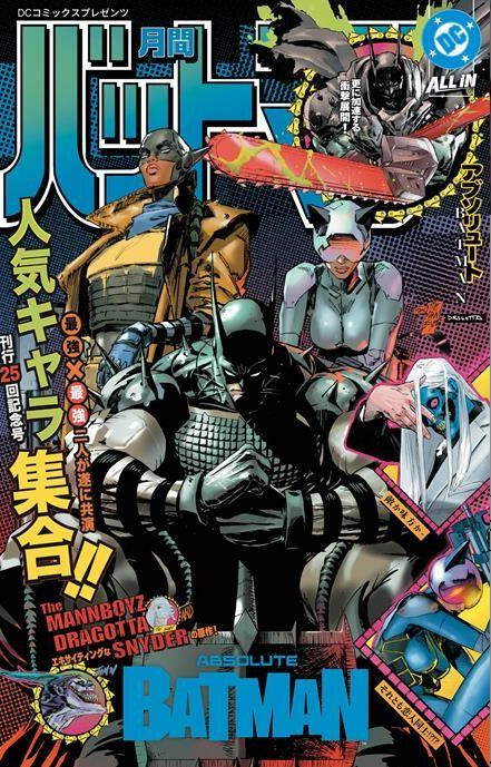
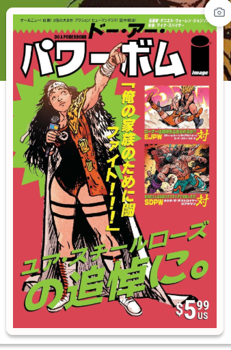
From Batman to Do a Powerbomb, Japanese manga-magazine aesthetics are making waves in American comics. But can publishers recreate the magic?
Something interesting is happening in the comic book market, and Absolute Batman #25 may have just given us our clearest indication yet.
For years, American comic publishers have experimented with manga-inspired variant covers. Some have been beautiful, others forgettable. But most followed a familiar formula: commission an artist with a Japanese-inspired illustration style, place the artwork inside traditional American comic book trade dress, and call it a manga variant.
There’s nothing inherently wrong with that approach. Artists like Peach Momoko have built devoted followings around distinctive interpretations of familiar characters.
But what if publishers have been overlooking something much bigger?
What if collectors don’t just want superheroes drawn like manga characters? What if they want superhero comics that actually look like Japanese manga magazines?
That’s where Absolute Batman #25 enters the picture.
Absolute Batman #25: More Than Another Variant
Released October 28, 2026, DC’s Absolute Batman #25 featured a striking foil variant by Clay Mann and Nick Dragotta, carrying an $8.99 cover price.
The artwork combines Batman’s unmistakable identity with the bold visual presentation associated with Japanese manga publications.
But the real magic isn’t simply the illustration.
It’s the complete package.
The vibrant colors, dramatic character composition, Japanese-inspired typography, and magazine-style presentation work together to create something that looks fundamentally different from a typical American superhero comic.
Rather than resembling a Batman comic drawn by a manga artist, it resembles a Japanese publication featuring Batman.
That’s a subtle but important distinction.
And collectors have taken notice.
The cover quickly became a hot topic among collectors, with aftermarket asking prices and reported sales moving well beyond its original retail price.
Whether those premiums prove sustainable remains to be seen. But the initial reaction raises an interesting question: Has DC stumbled onto a collectible aesthetic that American publishers have largely overlooked?
Do a Powerbomb: An Earlier Clue
Before Batman #25 captured attention, Image Comics was already experimenting with a similar visual approach.
Daniel Warren Johnson’s acclaimed Do a Powerbomb returned in July 2026 as a three-part black-and-white edition.
Although the interior artwork was presented in black and white, several covers embraced a much more colorful identity.
One particularly striking example is Do a Powerbomb: Black & White #1, Cover E, featuring artwork credited to J.B. Roe, Mike Spicer, and Daniel Warren Johnson.
The cover resembles a vintage Japanese manga or wrestling magazine.
Bright green and red backgrounds, oversized Japanese lettering, promotional inset images, and an intentionally crowded composition create an aesthetic that feels authentic to the publications it’s referencing.
It’s loud. It’s colorful. It’s unapologetically different.
And that’s precisely why it works.
Rather than merely borrowing manga illustration techniques, the design embraces the visual language of Japanese magazine publishing.
The three-issue black-and-white release also offers an interesting opportunity to examine how a consistent visual direction can distinguish a comic from its original publication.
Early secondary-market activity around the manga-magazine variant suggests collector interest, although additional sales data is needed to establish whether that interest represents a lasting premium.
Still, the resemblance to the design philosophy behind Batman #25 is difficult to ignore.
Manga Artwork vs. Manga Magazine Design
This is where the conversation gets particularly interesting.
Marvel has continued exploring Japanese-inspired superhero comics, including its recent Mangaverse material.
Take Web of Blood #1, for example.
The artwork embraces manga-influenced character designs, dynamic action, and bold colors. Yet the overall presentation remains recognizably American.
The familiar Marvel branding, English-language title treatment, and conventional comic-book layout make it feel like an American comic featuring manga-style artwork.
Compare that with the magazine-inspired designs of Do a Powerbomb or Absolute Batman #25.
Those covers attempt something different.
They borrow not just the artwork but the graphic-design conventions of Japanese publishing.
Consider the ingredients:
– Vibrant, high-contrast colors: Saturated reds, yellows, greens, and blacks that command attention.
– Japanese typography: Bold lettering integrated into the composition rather than treated as an afterthought.
– Magazine-inspired layouts: Promotional graphics, layered text, dramatic framing, and recognizable publishing conventions.
– Strong character presentation: Familiar characters reimagined through a different visual culture.
– A complete design identity: Every element contributes to the illusion that the comic belongs on a Japanese newsstand.
It’s the difference between drawing Batman in a manga style and making Batman look like the star of a Japanese manga magazine.
And that difference may matter to collectors.
The Shonen Jump Connection
Japanese manga magazines have evolved considerably over the decades.
Early American editions of Shonen Jump often featured crowded covers with multiple characters, promotional text, and layouts reminiscent of video game magazines.
Japanese editions of Weekly Shōnen Jump, meanwhile, have long experimented with bold typography, vivid colors, and character-driven compositions.
Some later covers offer particularly compelling examples of the aesthetic we’re discussing.
What makes the Batman variant interesting isn’t that it precisely copies any single issue of Shonen Jump.
It’s that it captures recognizable elements of that publishing tradition while maintaining Batman’s identity.
The result feels simultaneously familiar and new.
For American superhero collectors, it’s an unusual presentation of a recognizable character.
For manga enthusiasts, it’s a visual style associated with an entirely different reading culture.
Whether the cover is genuinely attracting buyers from both markets remains an open question, but the crossover potential is difficult to dismiss.
Are Publishers Missing the Point?
The upcoming manga-inspired covers for titles such as Transformers and Void Rivals, including artwork by Japanese manga artists, illustrate another distinction.
These covers may feature accomplished artists and authentic manga illustration techniques without necessarily embracing the colorful magazine-style presentation that makes Batman #25 so visually distinctive.
That’s not a criticism of the artwork itself.
Black-and-white manga art can be extraordinary, and collectors have supported it for decades.
But from a cover-collecting perspective, artwork and packaging serve different purposes.
A beautiful black-and-white illustration might appeal to fans of a particular artist.
A brightly colored Japanese magazine-style cover featuring Batman could appeal to an entirely different audience.
The question is whether publishers recognize that difference.
Marvel, in particular, has an enormous catalog of recognizable characters that could lend themselves to this treatment.
Imagine Spider-Man, Wolverine, or the X-Men presented with the same commitment to Japanese magazine-style graphic design.
Not merely manga-inspired artwork.
The entire visual package.
It’s an intriguing possibility, especially as American comics compete for attention in a marketplace where manga has become a major cultural and commercial force.
But Is This a Collectible Trend or Another Speculative Bubble?
Here’s where collectors need to exercise caution.
A hot cover doesn’t automatically become a valuable long-term collectible.
We’ve seen countless variant-cover trends generate extraordinary short-term enthusiasm before prices eventually retreat.
And if publishers begin flooding the market with Japanese magazine-style variants, the novelty could disappear quickly.
Scarcity matters, but demand matters more.
A limited-edition comic nobody wants isn’t necessarily valuable.
Likewise, an open-order variant with exceptional artwork and strong collector interest can outperform a supposedly rare incentive cover.
The important questions aren’t simply how many copies exist or how much they’re selling for immediately after release.
They’re whether collectors continue pursuing them after the initial excitement fades.
For Absolute Batman #25, that means monitoring completed sales, active listings, and sell-through rates over the coming months.
For Do a Powerbomb, it means examining whether the manga-magazine covers maintain collector interest once the Batman excitement subsides.
And for upcoming releases, it means separating genuinely distinctive designs from publishers simply chasing the latest trend.
The Million-Dollar Question: Who’s Next?
If Absolute Batman #25 represents the beginning of a broader collecting trend, the next successful cover may already be in development.
DC has demonstrated how effectively the aesthetic can work with an iconic American superhero.
Image Comics has shown that similar designs can complement independent titles.
Marvel has the characters, creative talent, and publishing reach to explore the concept further.
But the winning formula may not be as simple as commissioning more manga artists.
It may require publishers to think more like Japanese magazine designers.
The combination of dramatic character artwork, bold typography, vibrant colors, and authentic magazine presentation creates a visual identity that stands apart from conventional American comic covers.
And in a market saturated with variants, standing apart matters.
The real opportunity may not be manga-style covers at all. It may be the emergence of Japanese manga-magazine homage covers as a distinct collecting category.
Whether that becomes a lasting niche or another passing speculative craze remains to be seen.
But one thing is certain: Absolute Batman #25 has given collectors something worth paying attention to.
And somewhere out there, another cover artist may already be designing the next one.
The question is whether collectors will recognize it before everyone else does.
- Absolute Batman #25 and the Manga Cover Revolution: Why Collectors Are Taking Notice
- The Mark Spears Monsters Series: Why It’s Captivating Fans
- Top 15 List of Comics Submitted to CGC for Grading (Week of January 7th, 2025)
- Have Comics Lost Their Magic? Golden Age vs. Modern Comics
- Top 10 Unbelievable Comic Book Cameos Featuring Donald Trump
Leave a Reply